We rebuilt the storefront around the object. Product photography sits in generous space, on warm tonal grounds, with type that lets the form speak first. Nothing competes.
Premium ecommerce · Shopify, custom commissions · 2025
A keepsake brand built to match the craft of the object.
A premium Shopify build for an artisan studio forming sculpted dog busts and keepsakes. Paced like a gallery, structured like a shop, and made for a loyalty owners want to keep in the room.
Custom Shopify themeCommission pathwayFounder-managed catalogue
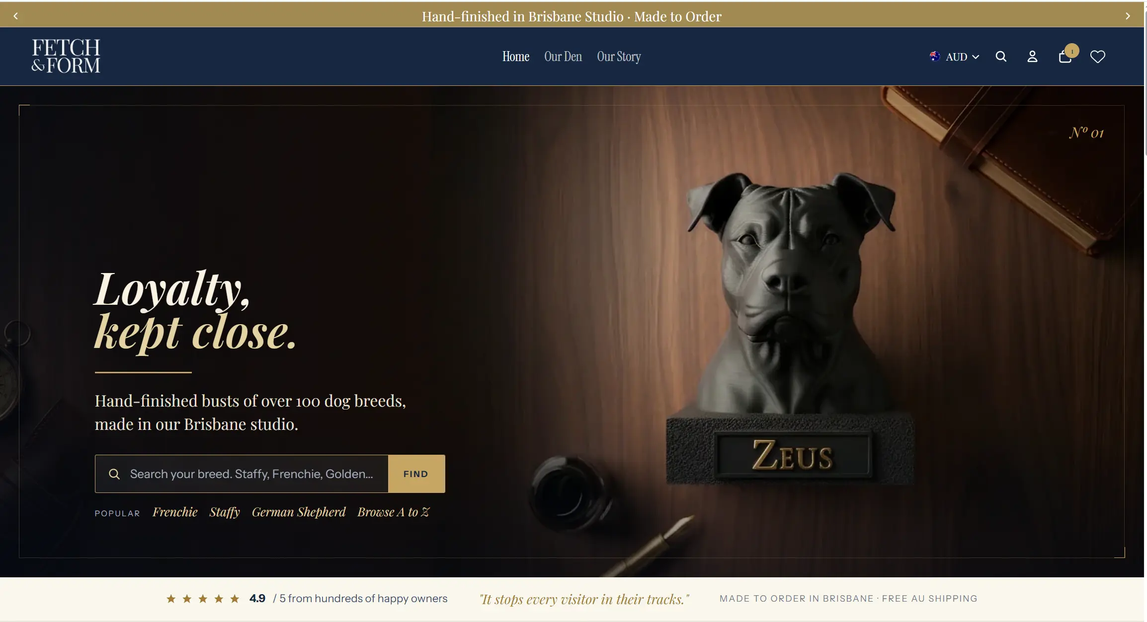
01 · Brief
Commissioning should feel like a conversation.
Fetch & Form make a quiet, deeply personal object, and their previous site was selling them short. It loaded fast enough, and it was visually noisy and structurally confused around their two routes to purchase.
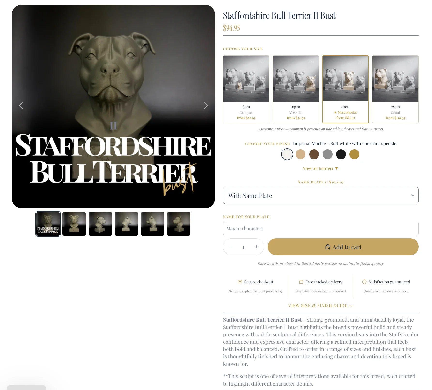
Ready-to-ship pieces sat alongside custom commissions that begin with a breed and a photograph, and the two competed for the same attention. The brief was to separate them, and to give the work the room it deserved.
Scope
- Shopify storefront design and build
- Breed discovery system
- Custom commission flow
- Product photography direction
- Performance and SEO foundation
- Studio handover and training
What mattered
- The object given room to speak
- Commissioning that reads like a conversation
- Mobile held to the desktop standard
02 · Approach
Quietly, deliberately, in order.
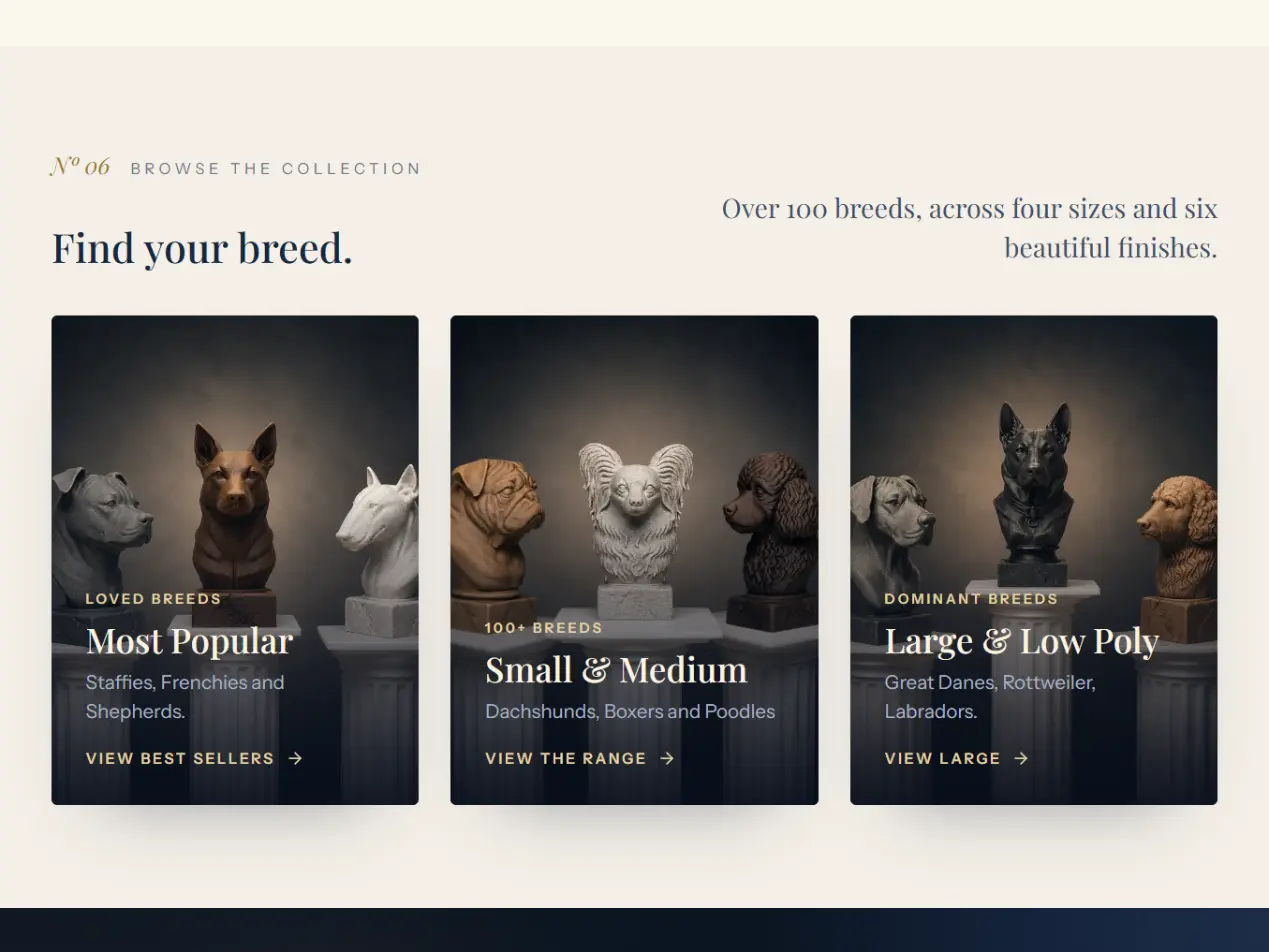
Breed discovery was the structural unlock. A long alphabetical list became an editorial index that respects how people actually search: by silhouette, by group, by remembered name. A Cavoodle is found in seconds, and a less common breed never feels like a dead end.
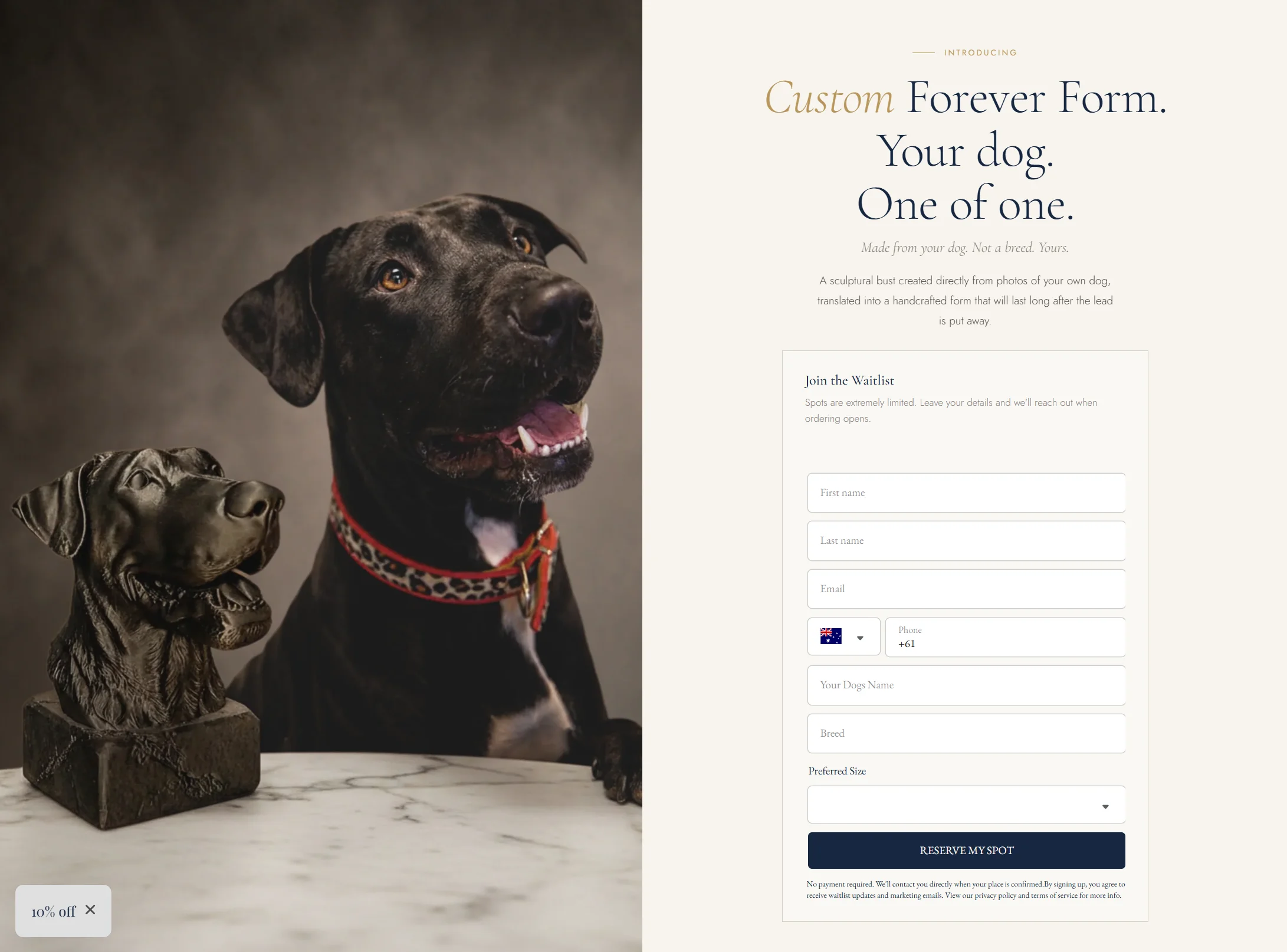
Custom commissions follow a deliberate four-step rhythm: choose the form, share the dog, confirm finishes, place the deposit. Each step is its own page, the wait is named honestly, and the studio's voice carries throughout.
We held to a strict performance budget on a Shopify build. Theme code is hand-written, third-party scripts are gated and lazy, and product imagery is served at the right size and format every time.
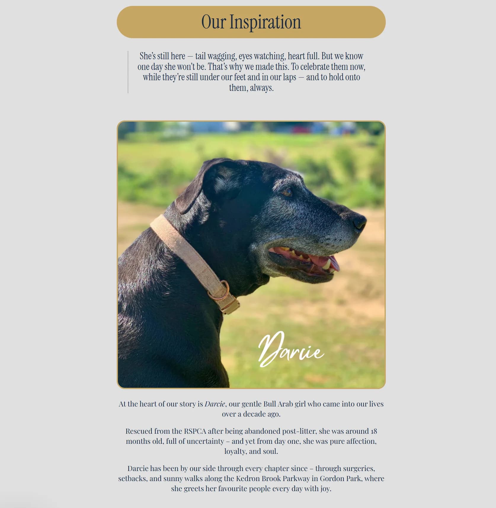
03 · Selected screens
From the finished build.
04 · Outcome
What the build delivers.
Two routes to purchase, each on its own clear path
A breed index built for how people actually browse
A commission flow that names the wait honestly
A hand-written theme held to a performance budget
Start a project
Discuss a similar project.
Send a short note about the business, the current website and the priority for this project.